• #MakeoverMonday

    #MakeoverMonday Week 50 – Bob Ross

    Another week, another MakeoverMonday and this week we’re looking at the paintings of Bob Ross. What a fun little data set! Here’s what I came up with:

    For some reason, I felt like doing a mobile layout. To get some design inspiration I scouted Pexels for nature and landscape photos or paintings. This beautiful abstract photo of Bondi Beach by Max Ravier caught my eye. I knew that I had found my background. I only added some blur to make it less distracting and ended up with this beautiful sunset gradient.

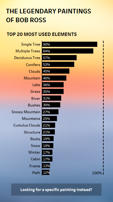
    The first viz is pretty simple. It’s actually very similar to the original image we gave a Makeover to this week. The only thing I changed was limiting it to the Top 20 instead of showing all possible elements. 

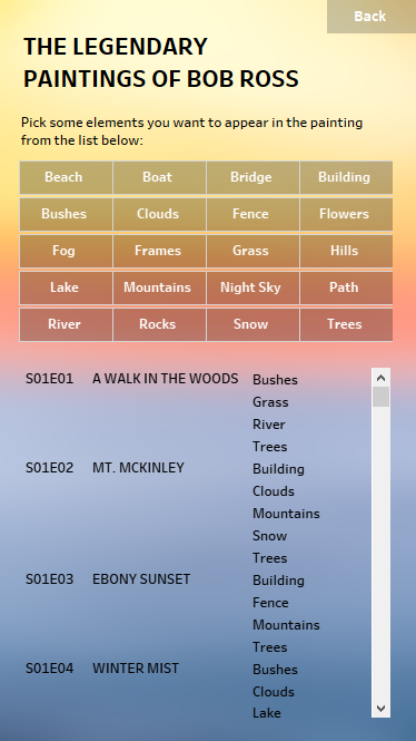
    For the second page, I wanted users to be able to find a painting by chosing the elements they want to appear in it. I grouped the elements (for example, putting all types of trees into one tree category) and created the grid layout. I then created a set and a set action that will filter the list depending on the elements chosen in the top part of the visualization. But here’s the catch – the filter based on the set will have an OR logic. For example, if you select ‚beach‘ and ‚boat‘ you’ll get all paintings that include either beach elements or a boat. But I wanted the results to be limited to only those paintings that include both elements. 

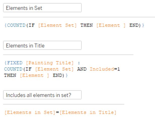
    Achieving the AND logic in this case requires a few LOD calculations:

    1) Calculate the number of elements that are currently in the set

    2) For each painting, calculate the number of elements that are both included in the picture and also included in the set

    3) Create a boolean field that checks whether the number of elements in the set is the same as the elements in the painting.

    Use this boolean as a filter and allow only TRUE values. Now only those paintings will be listed that include ALL of the elements chosen.

    And that’s it for this week. Check out the interactive version here.

  • Other vizzes

    US National Parks – an #IronQuest viz

    A data viz about US National Parks.
    My submission to #IronQuest: A mobile guide to US National Parks

    THE THEME

    This viz was created for the September round of Iron Quest which focused on Mobile-First Dashboards. I was very excited about this theme. Designing specifically for mobile was something I’ve had on my to-do list for a while. So this was a great opportunity to finally tackle this.

    THE TOPIC

    Since the theme was entirely focused on the design, it didn’t really set any limits on the topic of the viz itself. But I quickly settled on US National Parks as the topic for my viz. Since we can’t really travel because of the pandemic right now, I’ve started to do some research on potential travel plans for the future. And US National Parks are high on my post-pandemic travel bucket list. But I usually try to avoid the crowds. So I was especially interested to find out what the peak season for different parks are.

    THE DATA

    • The National Park Service provides some detailed reports on visitor stats.
    • I also used the National Park Service’s website to learn about the geology and landscapes in the parks.
    • I pulled the park descriptions and basic information from Wikipedia.
    • Wikipedia also had a list of mountains/elevations.
    • I found a data set about biodiversity in the National Parks on Kaggle.
    • Finally, I found more information about popular activities on us-parks.com.

    My data prep involved a lot of copying and pasting, and typing values into an Excel sheet manually. Not very sophisticated, but it did its job in the end.

    THE DESIGN

    For this viz, I actually started with the background. I’ve always wanted to try a gradient background. I scoured Pinterest for inspiration and found this greenish-blue gradient – which I felt would work well for the topic. I created the background in Powerpoint. I also used Powerpoint to create all the buttons. and the tree logo.

    I kept the visualizations themselves pretty simple. I stuck to pretty basic graph types overall and a monochrome black color scheme.  I used viz types like the stacked dots to get invididual marks for each National Park. This way, I was able to link them to the details page by a go-to action.

    Last point of order was including all the buttons and configuring the navigation. This actually took ages! Oh how I wish Tableau had a copy and paste function for stuff like that.

    THE VERDICT

    This #IronQuest challenge was super fun! It really motivated me to pay more attention to mobile design in the future. It’s definitely challenging – configuring all the navigation needed to make it work was quite time-consuming. On the other hand, it really forces you to keep a tight focus and to sharpen your message – which is a good exercise for any kind of dashboard!