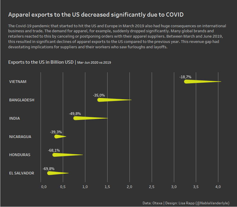
I myself are honestly suprised by this result: First time I’ve ever used a Comet chart and I rarely do dark backgrounds. I think the comet chart works well in this case where we want to compare values for two years.
But, in one respect, this viz is kind of a cop-out. I really struggeled with orientation – which field should I put on which axis? Usually, I follow two rules rather dilligently:
- Time goes left to right – so on a horizontal axis
- Categories go top to bottom – so vertical axis
In this viz, I really struggeled finding a compromise because we had two different time dimensions (years and months) and for some reason I couldn’t find a combination I liked. So due to my time-constraint I coped out in the end and simply aggregated the months to avoid the problem.
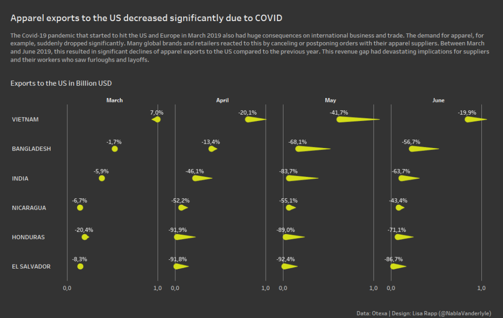
In hindsight, I should have included the months and could have ended up with something like this: