THE THEME
This viz was created for the September round of Iron Quest which focused on Mobile-First Dashboards. I was very excited about this theme. Designing specifically for mobile was something I’ve had on my to-do list for a while. So this was a great opportunity to finally tackle this.
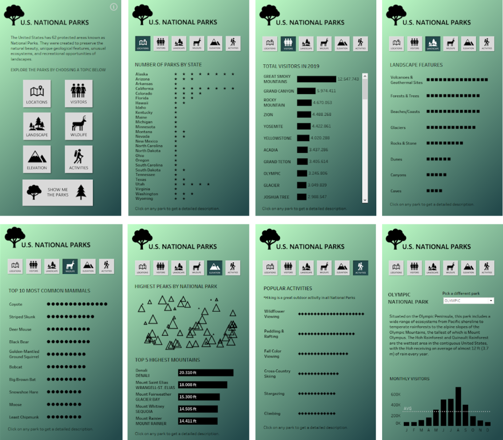
THE TOPIC
Since the theme was entirely focused on the design, it didn’t really set any limits on the topic of the viz itself. But I quickly settled on US National Parks as the topic for my viz. Since we can’t really travel because of the pandemic right now, I’ve started to do some research on potential travel plans for the future. And US National Parks are high on my post-pandemic travel bucket list. But I usually try to avoid the crowds. So I was especially interested to find out what the peak season for different parks are.
THE DATA
- The National Park Service provides some detailed reports on visitor stats.
- I also used the National Park Service’s website to learn about the geology and landscapes in the parks.
- I pulled the park descriptions and basic information from Wikipedia.
- Wikipedia also had a list of mountains/elevations.
- I found a data set about biodiversity in the National Parks on Kaggle.
- Finally, I found more information about popular activities on us-parks.com.
My data prep involved a lot of copying and pasting, and typing values into an Excel sheet manually. Not very sophisticated, but it did its job in the end.