• Other vizzes

    Are Best Practices always best?

    I recently published a viz in which I looked at some characteristics of world leaders in the last 70 years. I looked at four categories that each had two groups – Gender (Male/Female), Age Group (above/below 60), whether the leader was elected or not, and whether the country was a democracy or not. Here’s the viz I created:

    Here’s a question I feel is worth discussing:

    Should I have followed best practices for this viz?

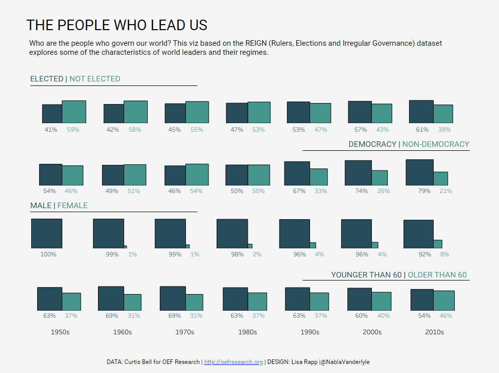
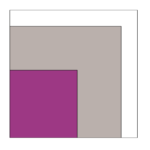
    Let’s start by looking at some of the things I like about the viz as it is:

    • It piques my interest because it’s a little bit different than most vizzes I see.
    • I personally find it visually pleasing. I think it’s because I like the symmetry of the squares.
    • I think it manages to drive the basic message: I can tell how the ratios have changed over time.

    But what are some of the draw-backs I can identify?

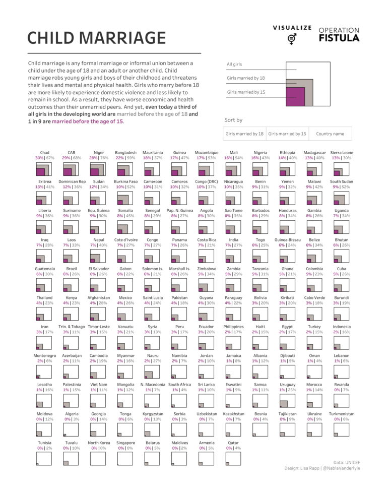
    • We as humans are super bad at estimating areas. It’s the same problem I mentioned for my Child Marriage MakeoverMonday.
    • The numbers for each pair of squares always add up to 100%. That fact, however, is not obvious at first glance in this viz.
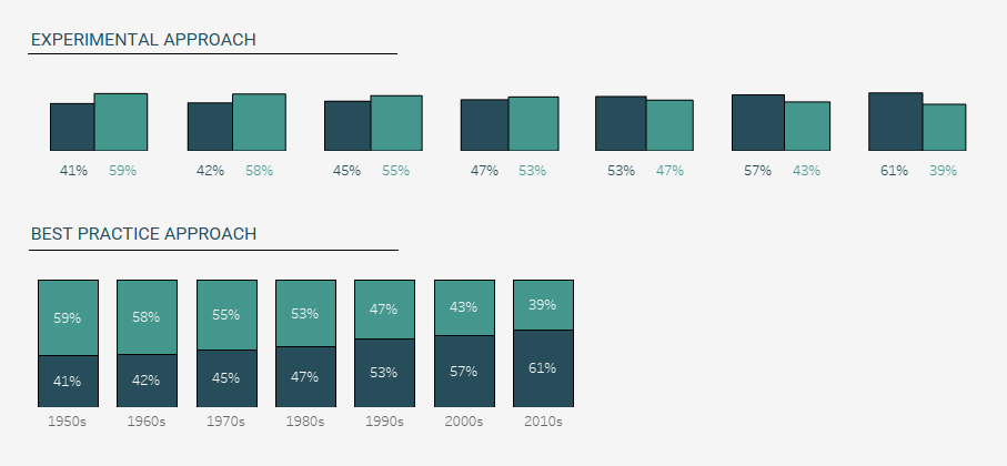
    • A simpler way to represent this data – and the one I would consider the best practice approach – would have been with a stacked bar chart. This would also make it easier to quickly see the change over time.

    So… taking the more experimental road with the dual squares or sticking to best practice and using a stacked bar chart? What’s the better approach in this case? I’m happy with the dual square chart in this context but in a business context, I would probably stick to the stacked bars. But I created a comparison below and you can judge for yourself which one you like better…

  • #MakeoverMonday

    #MakeoverMonday Week 39 – Child Marriage

    THE PROCESS

    This week’s dataset consisted of only 4 fields: the country name, percentage of girls married by 15, percentage of girls married by 18 and percentage of boys married by 18. I decided to concentrate on the girls and not use the boys percentage. The next thing I noticed was that the girls married by 15 are a subset of the girls married by 18 and I wanted my viz to reflect that somehow. That’s how the idea of the squares within squares formed in my head.

    But how to get there?
    I knew I had to use polygons – something I’ve never really worked with before. Luckily, the Flerlage Twins are there to help you out with a handy blog post. Some data prep was needed (pivot the measure columns and quadruple the data to be able to draw the 4 corners of the square), do some calculations to get the positions of the corners – and voilà!

    Next, I had to get the country labels look nice. For that, I used another trick that was in Kevin’s blog post mentioned above: create the labels on a separate sheet and float them behind the polygon viz. I positioned the labels using transparent shapes – another trick I learned from the Flerlage’s blog. This has quickly become one of my favorite and most-used little tricks ever since I read the 14 use cases for transparent shapes blog post. 

    All that was left after that was implementing the sort functionality. I actually handled this in data prep by creating index fields based on the three sort options. Depending on the sorting parameter I would then use those indexes to calculate the X and Y position of each country in the small multiples grid. I then created the sort buttons and configured the parameter action.

    THE VERDICT

    All in all, I really liked how this turned out. It was really fun to try something new and explore polygons. I also rarely do small multiples, so that was a good opportunity for me to get more used to them. What’s also cool is that this was one of those cases where I had an idea in my head and I actually managed to recreate that exact idea – something that sadly doesn’t happen all the time. I do feel like this viz got more attention than I would usually get – so I guess other people out there liked it, too.

    However, let’s be very clear about something: This is not necessarily what I would call a best practice approach. Is it compelling to look at? I would say so. But is it the best way to communicate the data? Maybe not. Because check out the example on the right: If the white square is 100% – how much do you think the grey square represents? The correct answer is 76%! The first time I saw this I thought my calculations must be wrong. But I double-checked. They’re not. It’s just that we are super bad at estimating and comparing areas!