• Other vizzes

    Behind the viz: Biggest boybands of all time

    A few days ago I published a new viz that I called The Biggest Boybands of all Time. This one has been flying around as an idea in my head for quite some time. But when I had a few days off after Christmas, I finally had time to sit down and actually create it. In this post, I’ll talk a bit more about how this viz came about.

    Idea & Data Collection

    This viz first started when I stumbled upon The Pudding’s awesome Internet Boy Band Database. This is a collection of boybands with No. 1 hits on the Billboard Hot 100, as well as more information about their members (such as age, physical traits, clothing style, etc.). This dataset was so much fun, however, it included a lot of qualitative data and not many numbers to do cool stuff with. But it got me googling and I soon wanted to find out what the most successful boybands of all time are. It’s actually surprisingly hard to find any decent data on that. Apparently, international record sales are not easily available. In the end, I settled for the numbers given in this Top 10 list by German music magazine Musikexpress. I then used good old Wikipedia to gather more information about the boybands on that Top 10 list. Overall, all of the information that is in the viz comes down to this (plus the names of the boyband members and the albums):

    Sketching & Data Preparation

    That’s where the real data prep fun only began, though! 

    For this viz, I started with some sketching (which I rarely do, but it was vital in this case)! As you can see, this first sketch is actually not that different from how the viz turned out in the end. I started with the top part and imagined the members (abstracted to be little blocks) standing on a kind of podium (which scales with the record sales). And then from that, I just thought of different ways to incorporate the other information I had gathered.

    Okay, I had an idea of where I wanted to go – but how to get there? Obviously, this whole construct consists of different viz types. So putting it all together in Tableau would either require a crazy amount of worksheets – or I would have to go down the polygon route. But that would require some more calculations and data prep.

    A raw sketch of the boybands data viz.

    I first divided the final object into individual polygons:

    • 1 small rectangle for each member of the boyband
    • 1 larger rectangle for the record sales
    • 1 very flat rectangle representing the timeline
    • 1 triangle as the marker on the timeline
    • 1 rectangle representing the bar for years active
    • 1 rectangle to fill up the rest of the bar
    • 1 square for each album

    You’ll now have to create a row of data for each polygon edge, specifying its position on the x and y axes. That’s how in the end that 10-row-dataset from above snowballed into more than 800 rows of data. There was lots of calculating but with a bit of patience, some more sketching and the help of Excel I figured it out. It truely felt like being back in geometry class at times.

    Creating the viz

    The cool thing about doing it all with polygons is that your viz comes together just like that, without you really having to do much additional work at all. You just set the mark type to ‚Polygon‘, pull all the things that will create the individual polygons onto the Details shelf and specify the path (i.e. the order in which the different edges of the polygon will be drawn). And voila – your viz is basically done!

    My initial idea was to keep it very simple, very minimalistic and keep it completely black and white (I guess I was still inspired by the recent #IronQuest challenge). I think it looks pretty cool as well, but I wasn’t 100% convinced. I felt like the simple colors did not really match the topic at hand. Boybands called for some more vibrant colors. For me, boybands equal 90s and 90s equal neon colors. So why not go full out neon?? I browsed Pinterest – my go-to source of inspiration for color schemes and landed on this cool color scheme on Imgur.

    Almost done! For the finishing touch, I wanted to create this neon-sign glowy effect. My polygons were not enough for that – I needed lines! Luckily, you can create almost the same viz by simply changing the mark type to ‚Line‘. The only catch is that you’ll need one datapoint more for each polygon: For example, if you want to create a square with a line you’ll need 5 data points. That 5th data point will be the one that brings you back to where you started drawing the square and thus close it off.

    So I duplicated my dataset, added the additional points and brought it back to Tableau. Then I gave my polygons some opacity and layered the lines on top of the polygons – and we’re done!

    TLDR – From sketch to first draft to final result
  • Allgemein

    My 2021 data viz resolutions

    After looking back at the year that was in my last two posts, it’s now time to think about what lies ahead. So here are my new year’s resolutions for 2021:

    • Quality over quantity – 2020 was all about putting as much content out there as possible. This year, I want to push myself to put the best possible content out there even if it means not making as many vizzes as last year.
    • Creating my own content – Most of the vizzes I created in 2020 were initiated by one of the many great community initiatives like MakeoverMonday. That also means that most of the time I did not really chose the topic myself. So, this year, I’ll try to create more content of my own accord. 
    • Data storytelling – Many of the vizzes I made in 2020 were pretty simple. Most often they were straight to the point with a single chart. This year, I want to improve my data storytelling. I want to focus more on longform vizzes, dashboarding and vizzes containing multiple charts. 
    • Collaboration – I would love to work on some vizzes together with someone from the dataviz community. So, if you’re reading this and this sounds like something you could imagine doing – please get in touch with me!
  • #MakeoverMonday

    A year of MakeoverMonday

    Welcome to a new year, dear reader! 2020 is finally gone. Time for one last look back before we put it on the ash heap of history where it belongs. Last week, I already reflected on all the vizzes I created in 2020. A huge part of those vizzes came from MakeoverMonday. So in this post, I’ll specifically talk about my MakeoverMonday experience. 

    By the end of 2019, I had learned all the Tableau basics and passed the Tableau Desktop Certified Associate Exam. So what next? I already knew of MakeoverMonday and had used some of the older datasets to build my Tableau skills. But for 2020 I decided it was time to become actively involved. So when the new year arrived, I set myself a new goal: Complete all #MakeoverMonday challenges in 2020! 

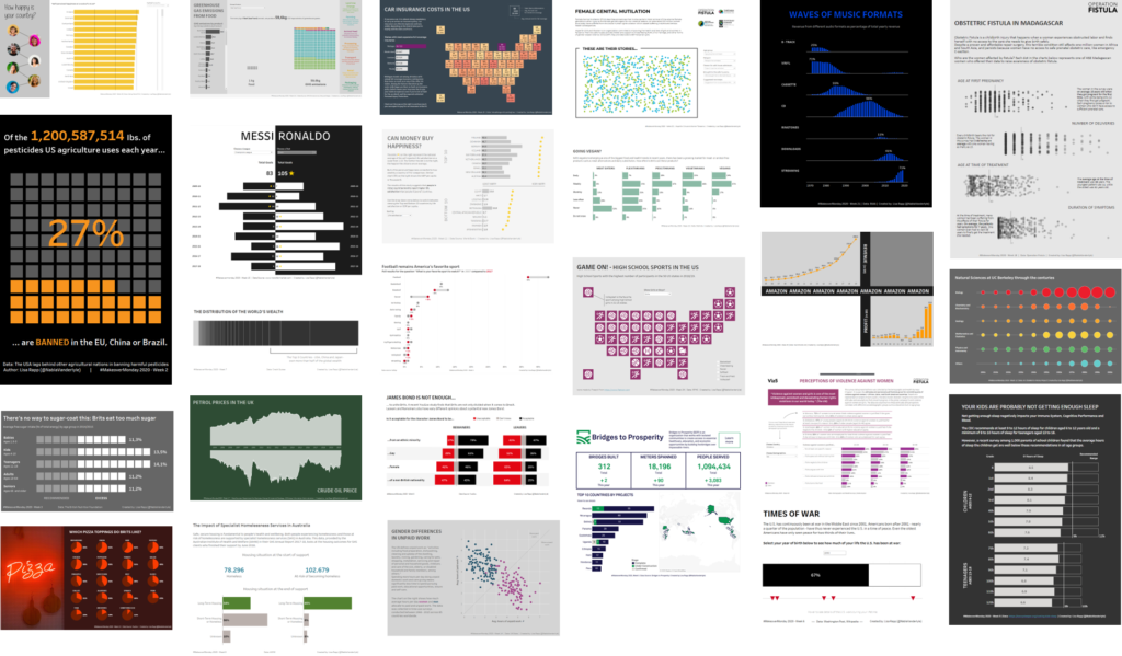
    Now that 2020 is over I can proudly report that I did it (well, almost… I’m still missing Week 47 but I’m just going to ignore that). So here it is – at a glance – a year’s worth of MakeoverMonday vizzes:

    An overview of 25 different data visualizations.

    As you would expect, not every one of those vizzes is a hit. But there are actually very few that I don’t like at all and many that I still like quite a bit.

    My favorite vizzes

    Here are some of my personal favorites:

    Child Marriage

    The nested squares to show parts of a whole are still one of my favorite new viz types I’ve done this year. Even though they might not be 100% best practice, I think they look pretty. I’ve used them in several other vizzes since and I’m sure they’ll come up every now in then in my future vizzes as well. This viz was also the first MakeoverMonday viz I blogged about here on this blog.

    Waves of music formats

    You might have noticed from the overview of vizzes above that I rarely use dark backgrounds and bright colors. So this one is kind of different than what I usually create. I like the vibrant blue and the minimalistic style of that viz.

    Representation of women in politics

    This one looks like a book cover. More specifically, like the MakeoverMonday book. I swear that wasn’t intentional, but it must have been in the back of my mind somewhere. I remember it took me quite a while to make it look neat but I think it was worth the effort. I still like the design and the use of blank space to show where representation is lacking.

    Sugar consumption in Britain

    This one holds a special place in my heart. This is way back from Week 3. I think this was the first time I submitted a viz to viz review. Charlie and Eva gave some great advice and I went back and revised my viz. This then became the first viz that was picked as a favorite at the end of the week.

    Lessons learned

    Looking back at my year of MakeoverMonday vizzes – what are some of my key takeways?

    • Consistency is key: My main motivation for starting this project was to consistently create vizzes. MakeoverMonday gives you the easiest opportunity to do exactly that. You don’t have to spend time thinking about a topic and gathering the data. You can just go ahead and create. 
    • Not every dataset is gonna be equally appealing to you and that’s okay: With 52 different topics in the year, it’s quite obvious that some weeks will be harder than others. Sometimes the topic might not be as interesting to you or be something you know nothing about (Looking at you, Week 35 Cricket dataset). I was very aware of that fact when I started and promised myself to not let that deter me from creating a viz anyway. Honestly, it’s been good practice for my work as well, because let’s be real – your clients data will not always be the most exciting data you’ve ever seen or you might be having a hard time coming up with an idea in the beginning. Working through all the MakeoverMonday topics helped me prepare for that situation and assured me that I can in fact make a viz out of every topic thrown at me.
    • If you’re short on time – make that part of the challenge: In the beginning, I blocked a few hours on Sunday afternoon to create my viz, often with more time needed on Monday to finish it. But soon I found that I couldn’t keep up that time commitment. And the point is – you really don’t need to spend that much time on it. If you’re worried about the amount of time you’ll have to invest, I can only recommend trying time-boxing, i.e. limiting the time spent on creating a viz to maybe 1-2 hours. It’s actually a very useful exercise and something that’ll easily happen to you in real life anyway.
    • When in doubt – bar charts: Okay, it’s obviously not as simple as that. But when you look at all the vizzes I created you’ll see that there are many variations of bar charts in there. You’ll find the same thing if you go through the weekly favorites on the MakeoverMonday blog. Many of the MakeoverMonday datasets are pretty simple and that’s why simple bar charts are often the easiest and most effective way to present the data. I often feel like I need to invent a new chart type or do something super outlandish. But perfecting the bar chart can be a great goal, too!
    • Try something new with every viz: I tried to adhere to that rule as much as I could and incorporate something new, something I had never done before into each viz I created. It could be anything from a new chart type that I’ve never done before, or a Tableau feature I haven’t used before, to something as simple as a specific color I’ve always wanted to use.
    What’s next?

    After a year of MakeoverMondays, I still think it is one of the best datafam initiatives out there. It’s so much fun and the feedback you can get from it is so valuable. I don’t necessarily plan on doing all 52 MakeoverMondays again this year, but I’ll try my best to do as many as I can. There’s still a lot of things to learn and improve, so let’s keep practicing!